Per our client's request, our UX design progression is not front and center within this presentation/case study hybrid. Process, research, and user testing were critical to our design results so we created this Keynote to include the research evidence in a subtle way with our photos among the slides. In addition to being responsible for the visual design of this presentation, I (literally) crafted the card sort packages, designed the persona layout, completed the competitive/comparative analysis, illustrated the storyboards and designed configurator journey map. Our team was outstanding and it was a pleasure to work alongside these talented UX designers (Cat Dodge, Jessica Hamilton, and Tom Kilgore)
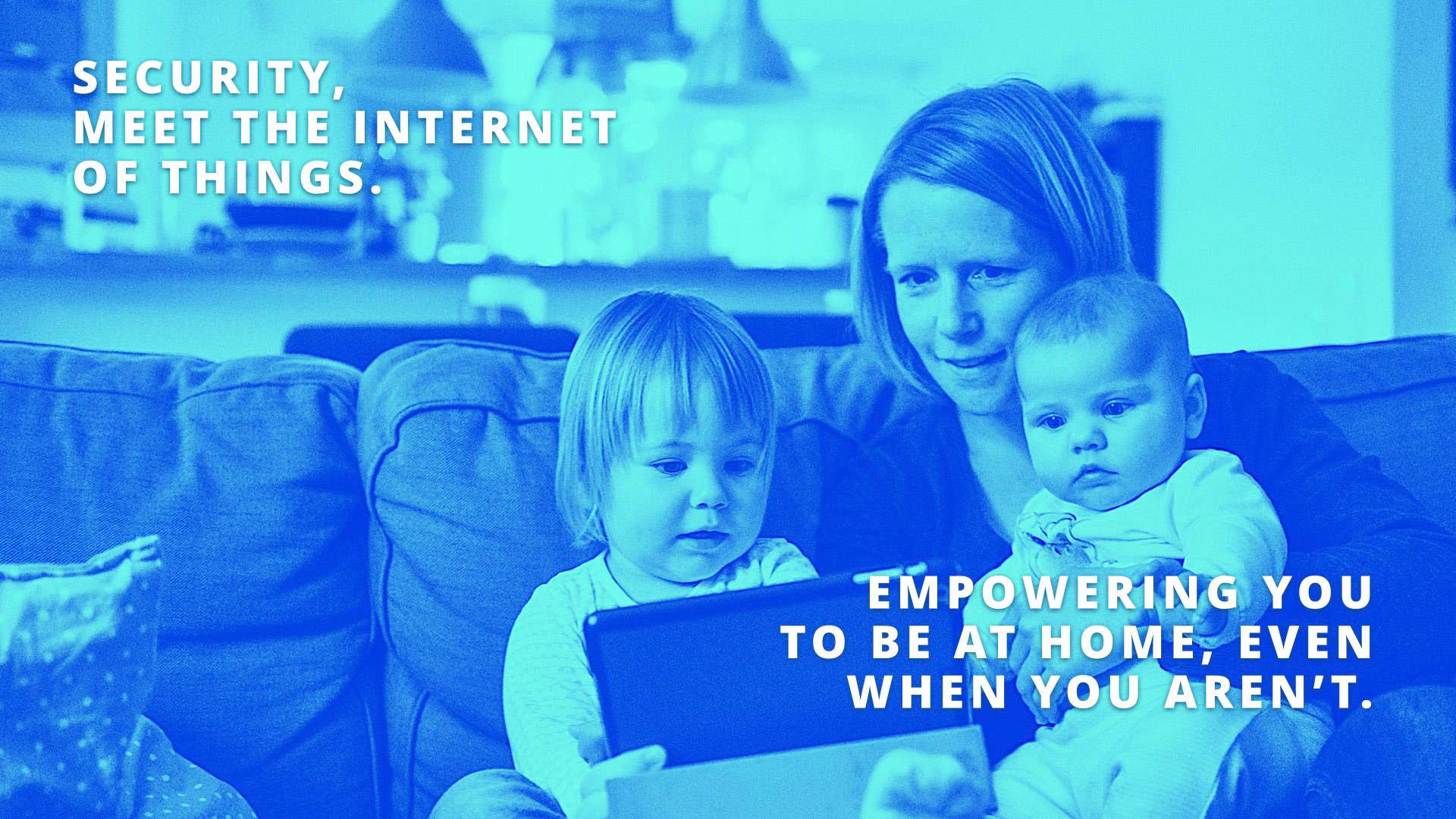
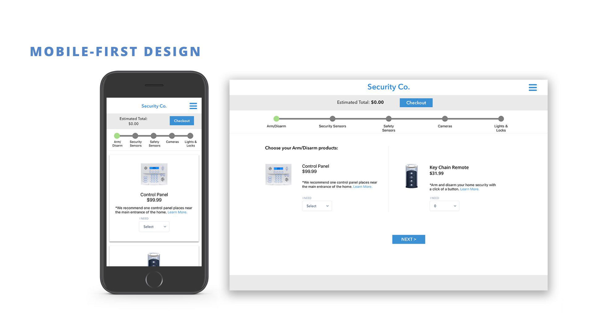
Home security has changed so much of the past 20 years with the advent of the internet of things. Our agency client realizes that consumers with wireless networks are now empowered to design and install sophisticated systems on their own. Smartphones allow users to monitor and control their homes on the go, and we designed our configurator with mobile-first in mind.
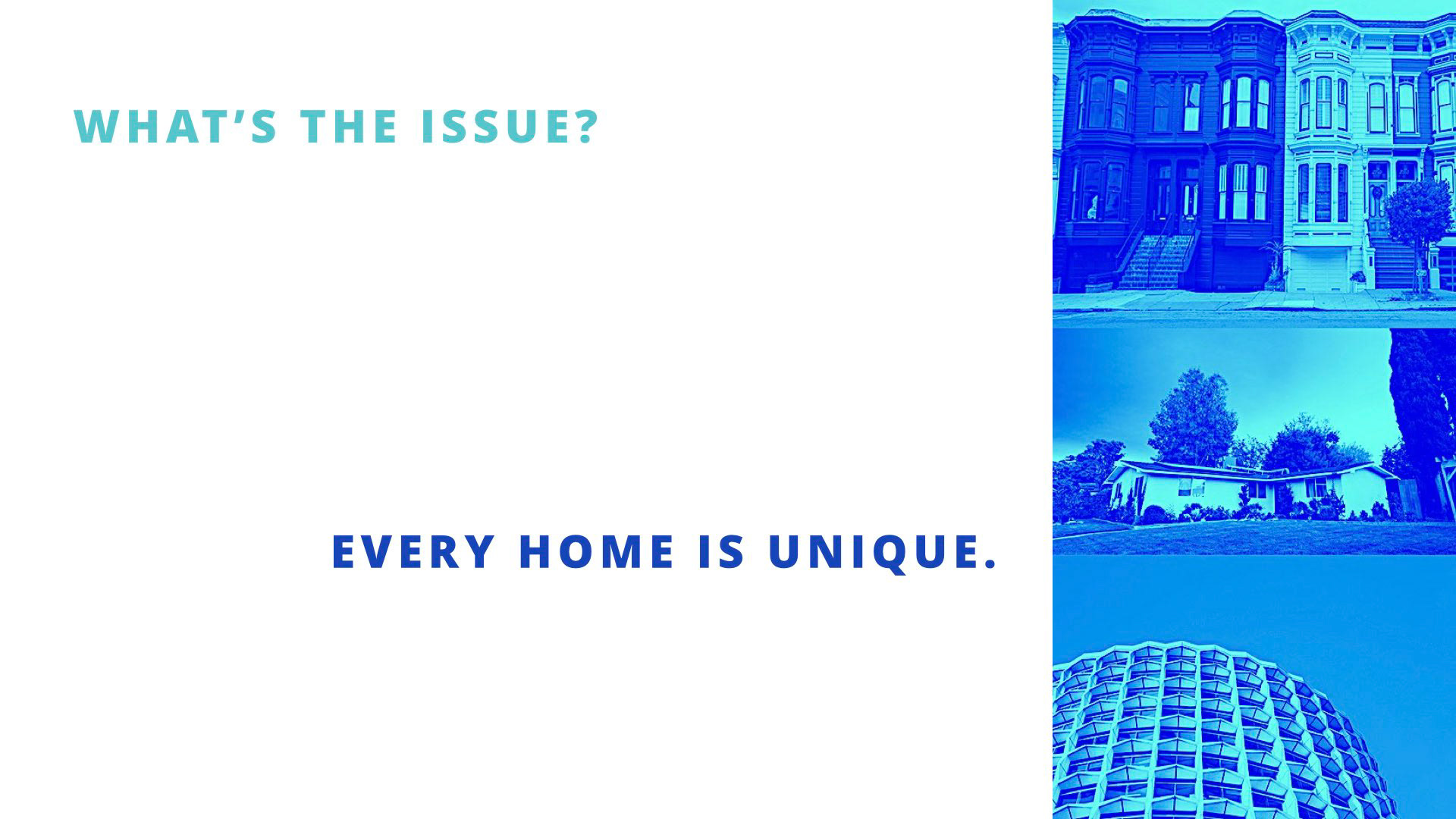
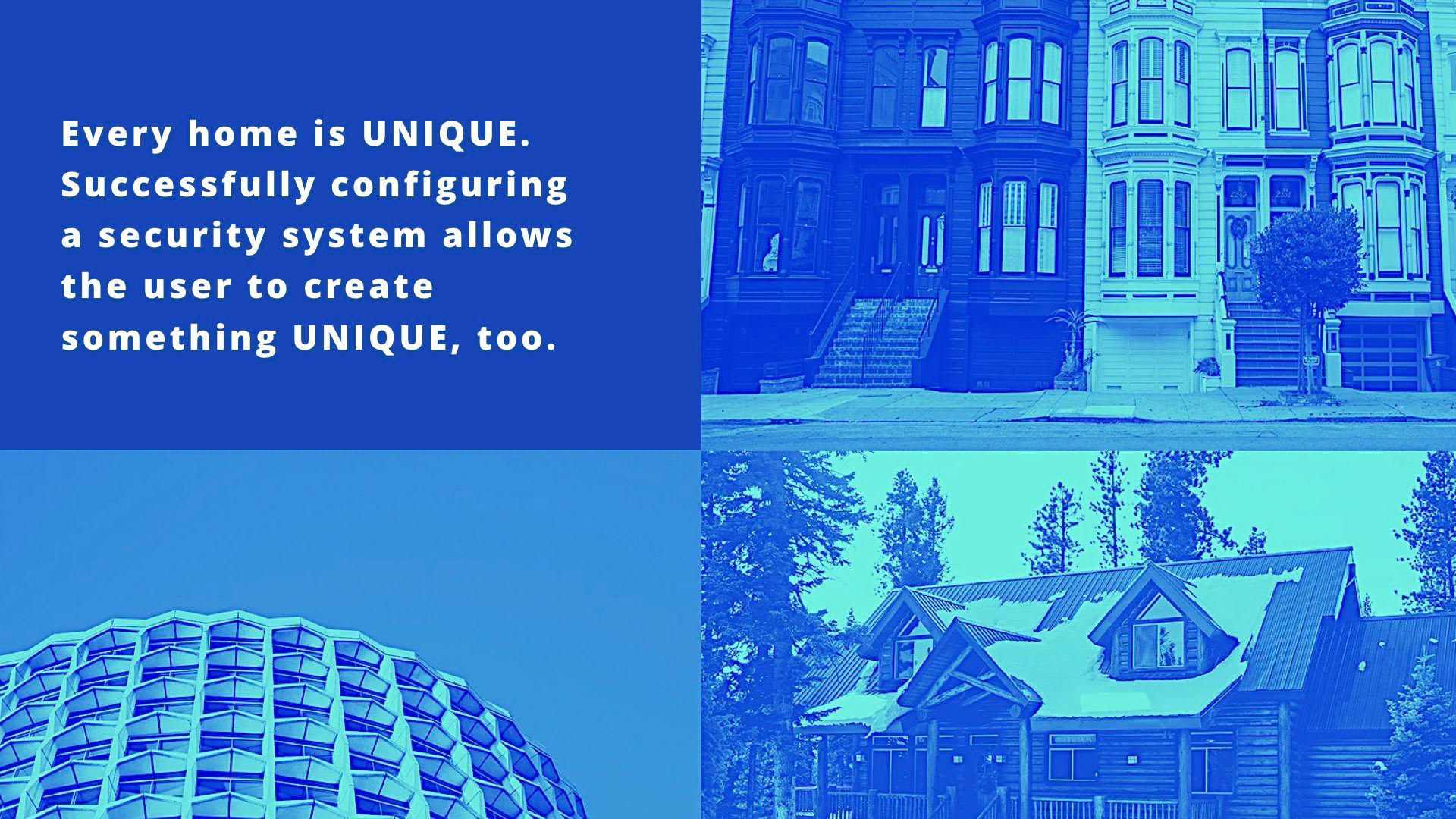
Between homeowners and renters, townhouses, apartments, condos and stand-alone homes, everyone has the opportunity to install their own system that meets their exact needs. Home security isn’t just for professionally wired houses anymore. Our research included these housing options.
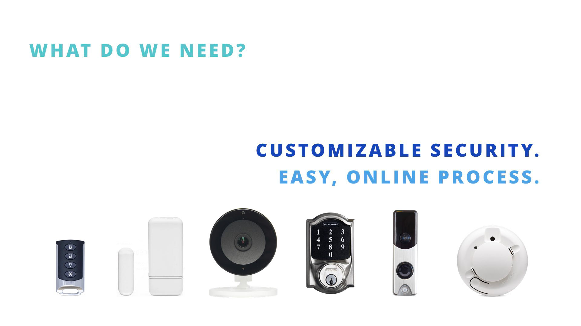
Our solution is to provide the most easily customizable security packages on the market. We empower people to go online to quickly & easily educate themselves to put together their own system, rather than having a company make their decisions for them.
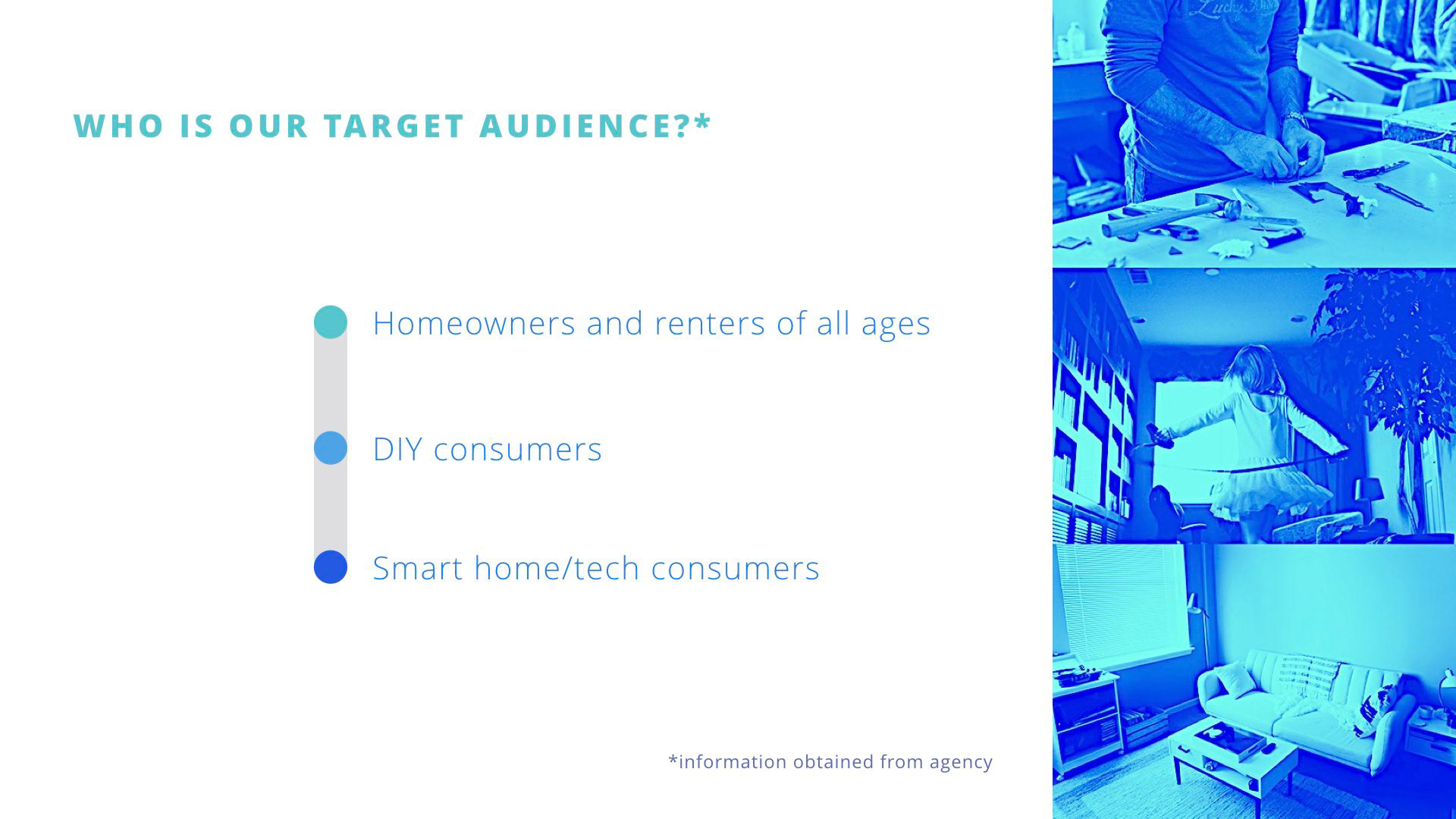
Our target audience includes all ages, renters and homeowners, DIY and smart home/tech consumers. The same people who remodel their home, and also monitor their doorbell camera and Google Home. They're familiar with technology and comfortable setting up technology in their homes.
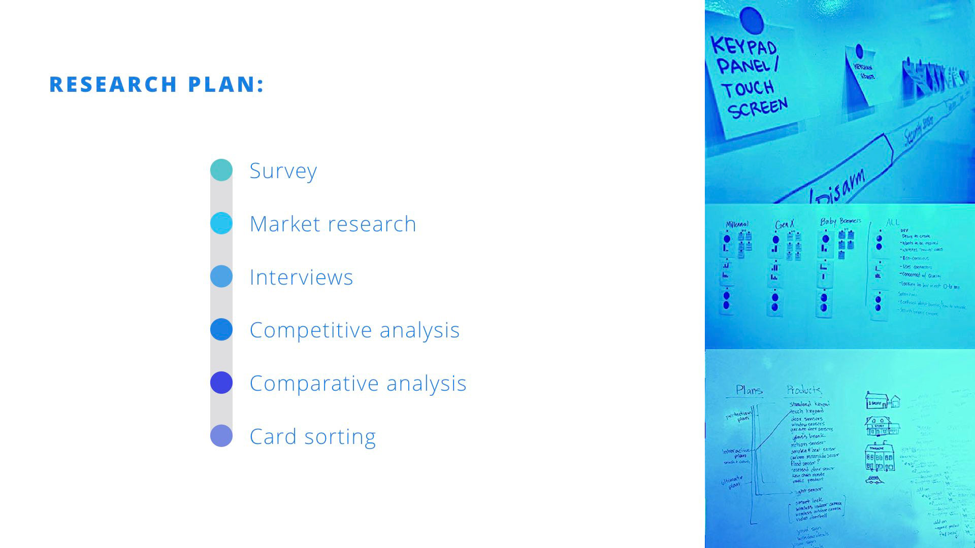
In order to find out more about our target audience, we conducted an online survey where we gleaned info from 140 respondents. We conducted in-person interviews, did a competitive/comparative analysis and conducted a card-sort practice to allow people to build their own security system. Through this research, we learned some of their pain points and UI needs.
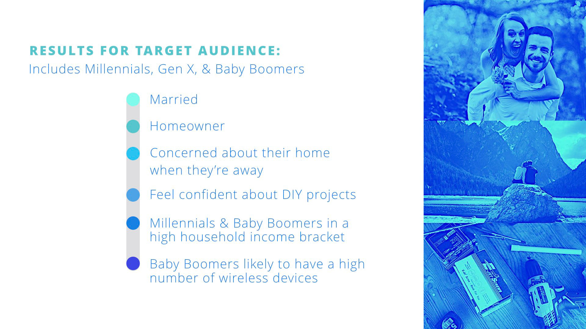
From our online survey results we narrowed the pool of 140 respondents to a TARGET AUDIENCE of 23 to narrow down our user data.
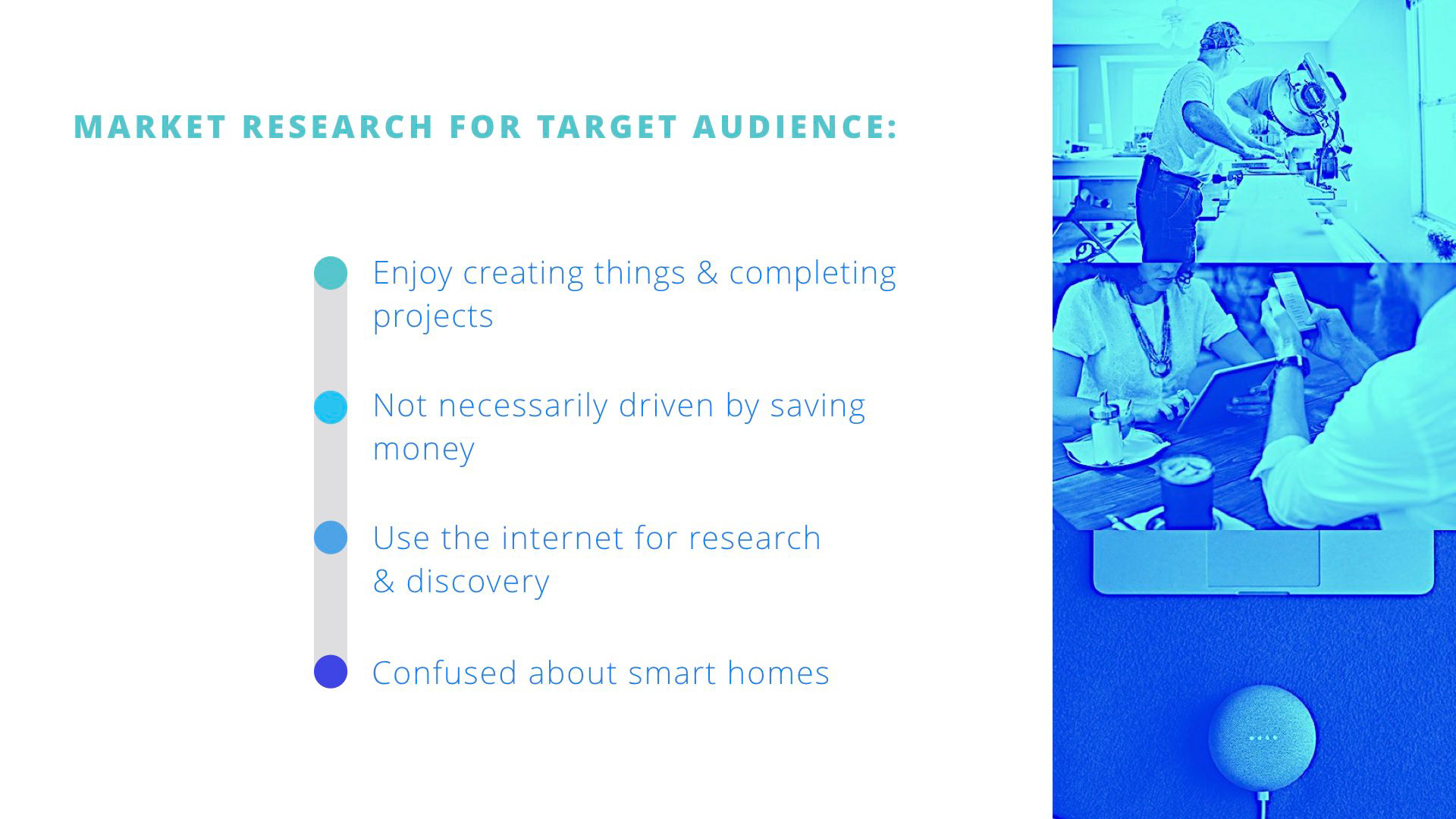
This market research information was collected about DIY’ers and smart home consumers, to gain insight into why and how they approach home projects. They’re intrigued by smart homes but confused about the value it offers and how to set it up.
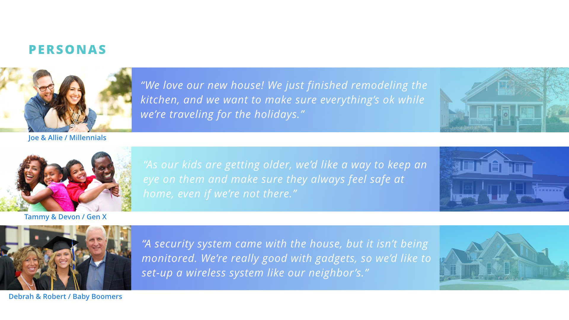
Millennials: $100-200,000, Married; NEEDS: An understanding of price & value; Mobile optimized experience; Phone apps for everything - like to feel empowered & are comfortable with DIY projects.
GenXers: Tammie stays home with kids; Lower HHI than millennial, so they’re concerned with cost. A way to feel more secure about leaving others at home with the children & a way to let family in the house.
Baby boomers: Value excellent customer service; A personalized experience; Comfortable with installing DIY wireless devices. Customized security system for their large home; Monitoring for vacation home.
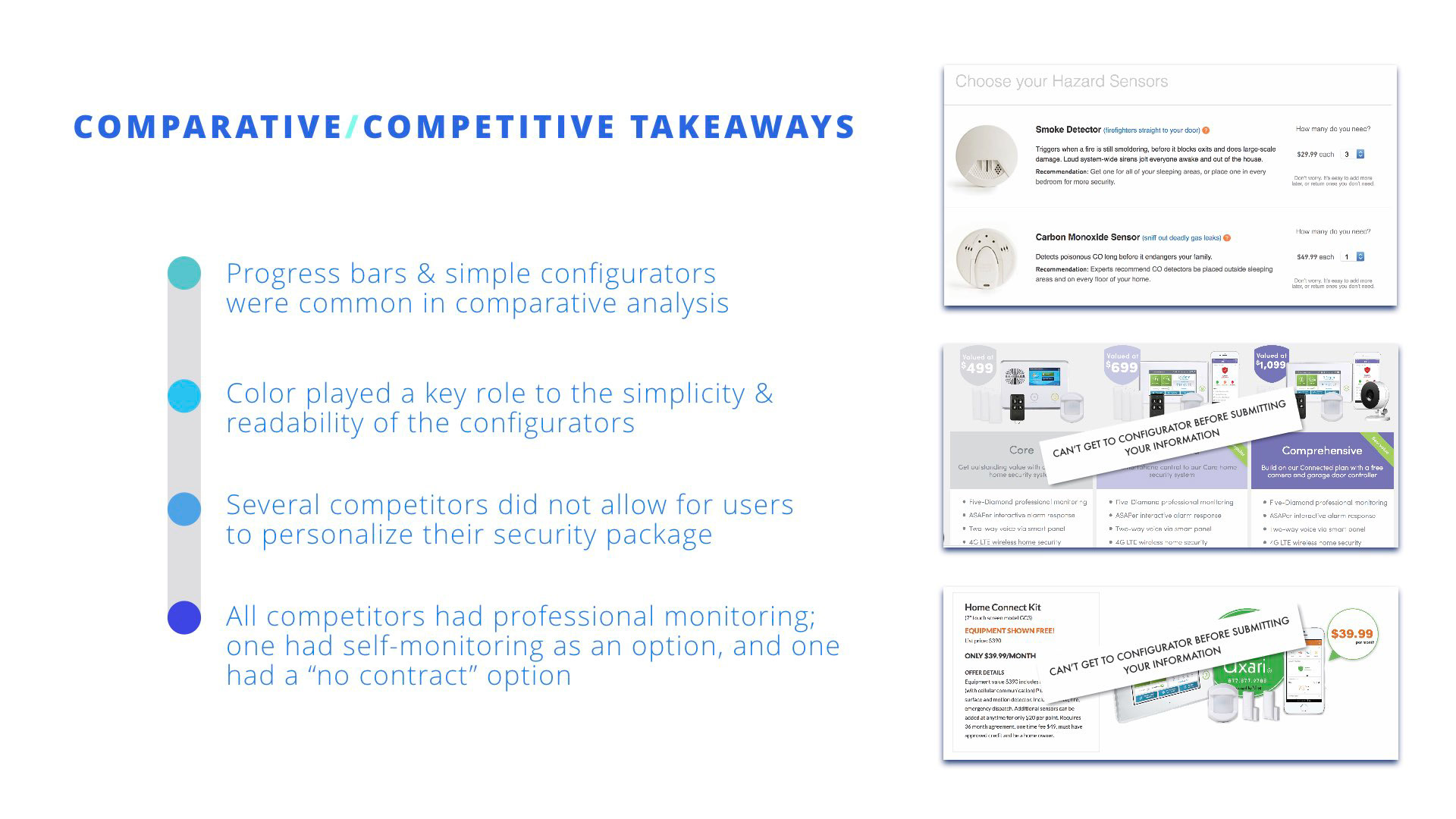
We conducted a competitive/comparative analysis, and gathered information about different websites and configurators.
When researching the competitors, we saw several opportunities for the client. Poor product information and confusing user flows were common. Not all competitors that we researched offered individual product selection, and for some companies, pricing and plan information were absent from the website. For comparative research, we looked at sites that offered product configurators, such as BarkBox and Ipsy. We noticed progress bars, and the use of clean, clear colors and illustrations were common elements.
When researching the competitors, we saw several opportunities for the client. Poor product information and confusing user flows were common. Not all competitors that we researched offered individual product selection, and for some companies, pricing and plan information were absent from the website. For comparative research, we looked at sites that offered product configurators, such as BarkBox and Ipsy. We noticed progress bars, and the use of clean, clear colors and illustrations were common elements.
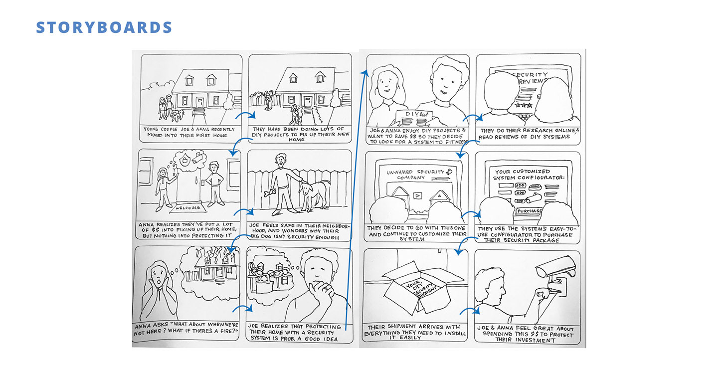
Based on our research, we created this storyboard to show the series of events our user might encounter.
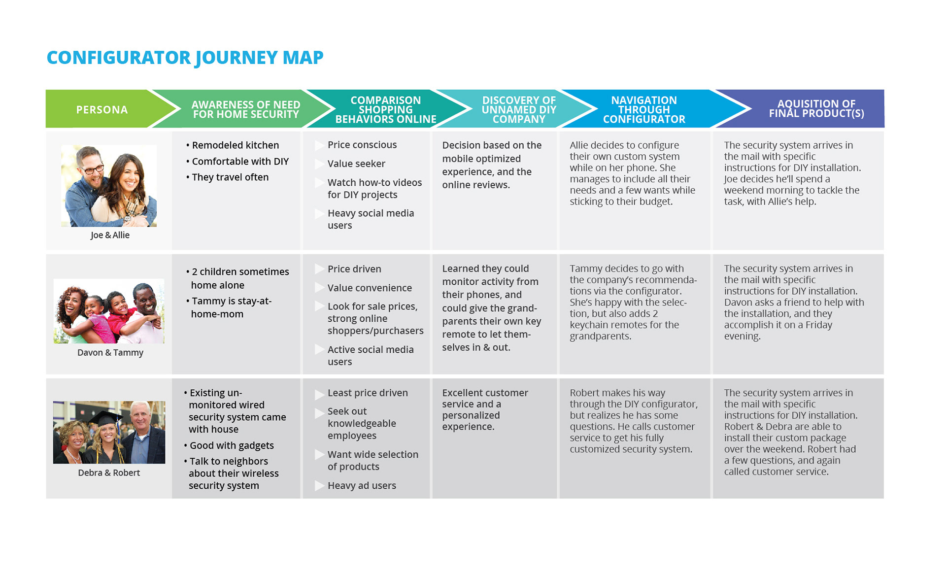
We illustrated our user's journey through the configurator to give our client a clear picture of the persona data and research.
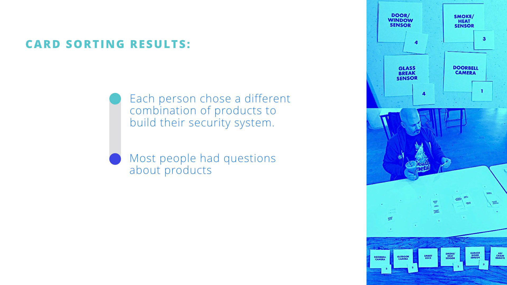
In order to better understand our user's needs and painpoints, we used a card sorting exercise. Users were asked to select cards with the components they wanted, and then identify the number of each component that they would need. We learned that each participant wanted a different combination of products. And while some users were more familiar with security systems, most still asked questions and wanted guidance when choosing components for their home.
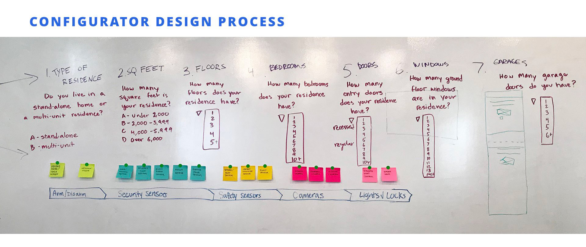
Based on the varying level of familiarity with products and the types of questions users asked, we decided that we needed 2 paths through the configurator to meet our users' needs. We planned these paths on the whiteboard to map out where they would diverge and then converge into the checkout process. One path features a series of questions to guide users to recommendations from the company. The second is a build-your-own path that guides users through direct product selection.
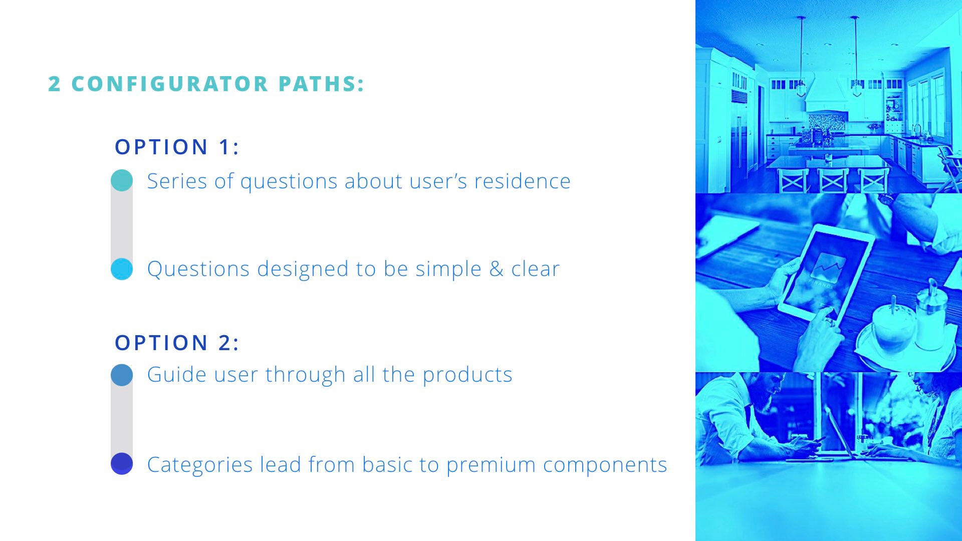
The first path offered by the configurator leads the user through a series of questions about the user’s residence. We designed the questions to be as concise and clear as possible to make the process simple and intuitive. The configurator provides both basic and smart home recommendations on the recommendation screen. The second path is designed for the users who already have a clear picture of their security system needs and wants. It guides the users through several categories of products, starting with the more basic options and ending with the premium components.
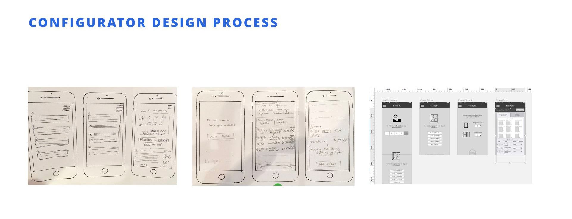
We took our planned flow and started to sketch out screens. We presented our paper sketches to members of our target audience for feedback, and used this as we developed our sketches into wireframes.
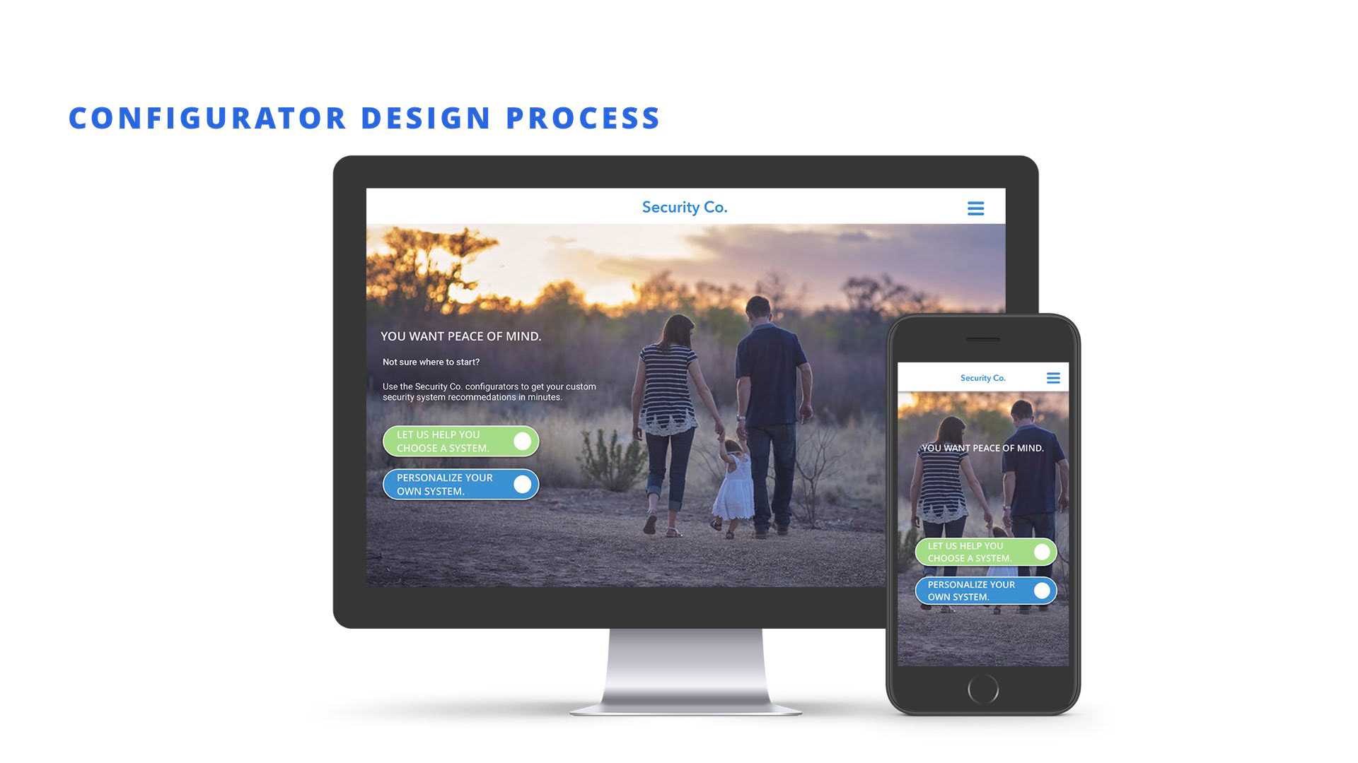
We developed our configurator prototype with mobile-first design. Here’s the first screen that introduces our user to the configurator choices. Option 1 in green offers the user the recommendations from the company, Option 2 in blue empowers the user to personalize their own system.
This is the mobile-first and desktop example of the start to where our user will develop their own system. Each product has its own white card to create a clean and easy-to-understand process.
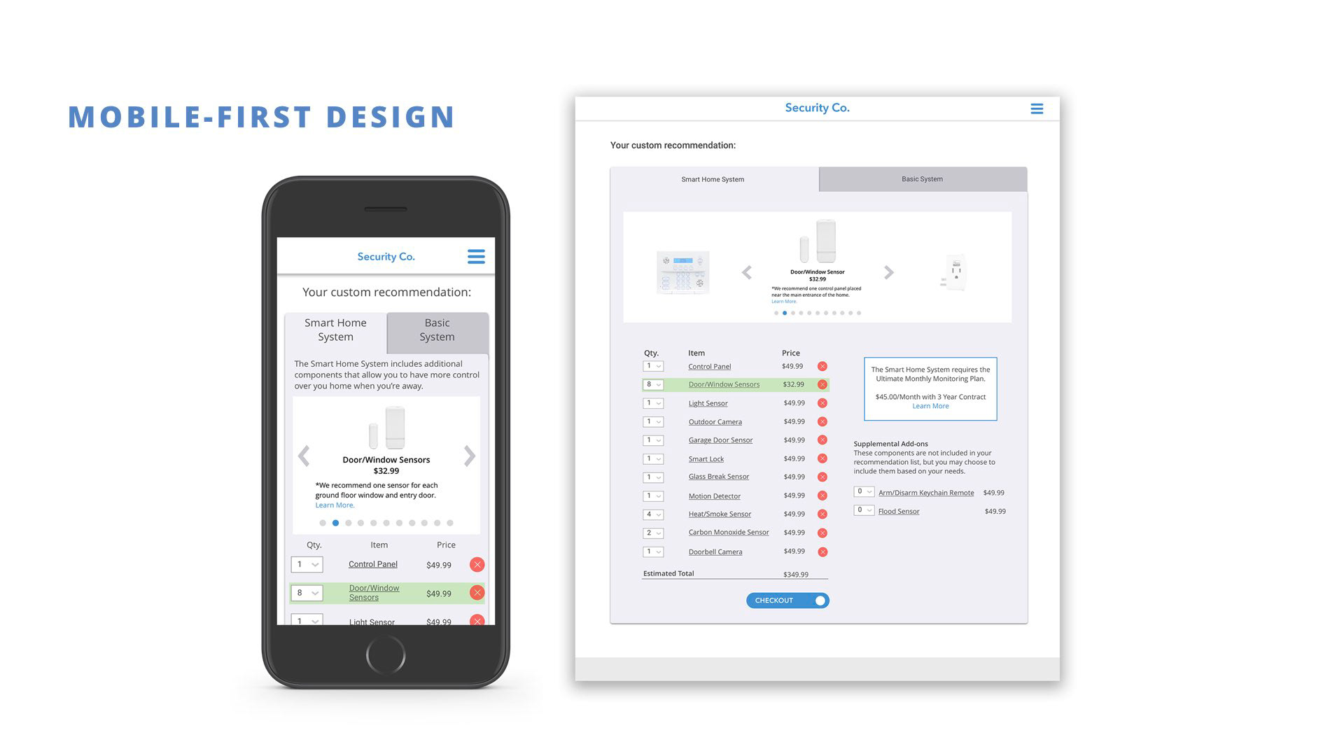
FF to the cart page of the configurator where the user can see what’s in their cart and make changes where needed. The tabs are condensed for mobile first, and they both include a carousel of products for validation and further review before committing to their purchase. 2 columns for review in the web version for updated cart information - in the mobile, they scroll down.
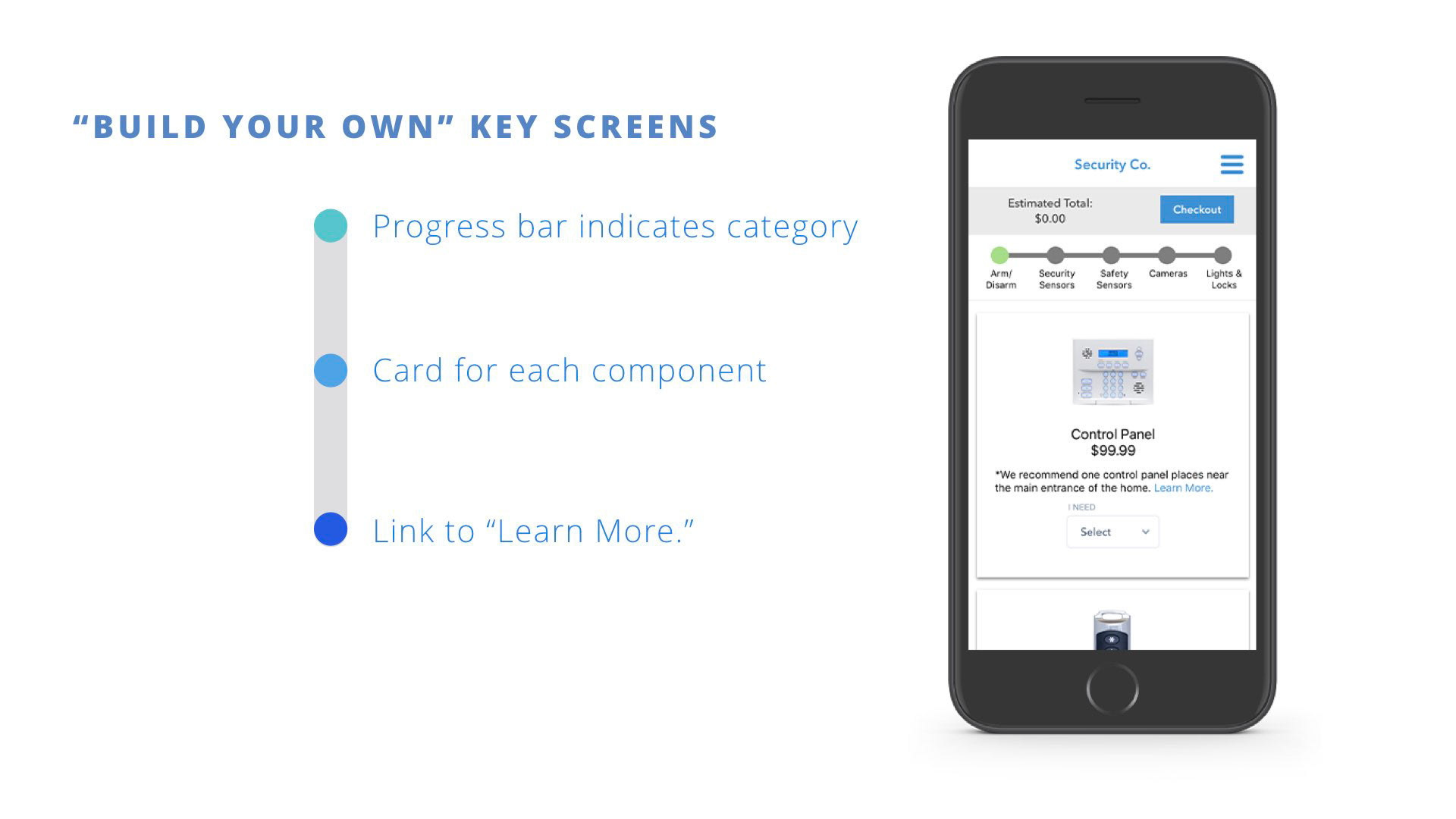
This is the first screen for the "build your own" system flow of the configurator. The user scrolls down through one product at a time, selects quantity, or can touch “learn more” to see more info, installation, dimensions, etc. about the product. The user will also be able to see the price at all times so they can make adjustments at any time in the selection process.
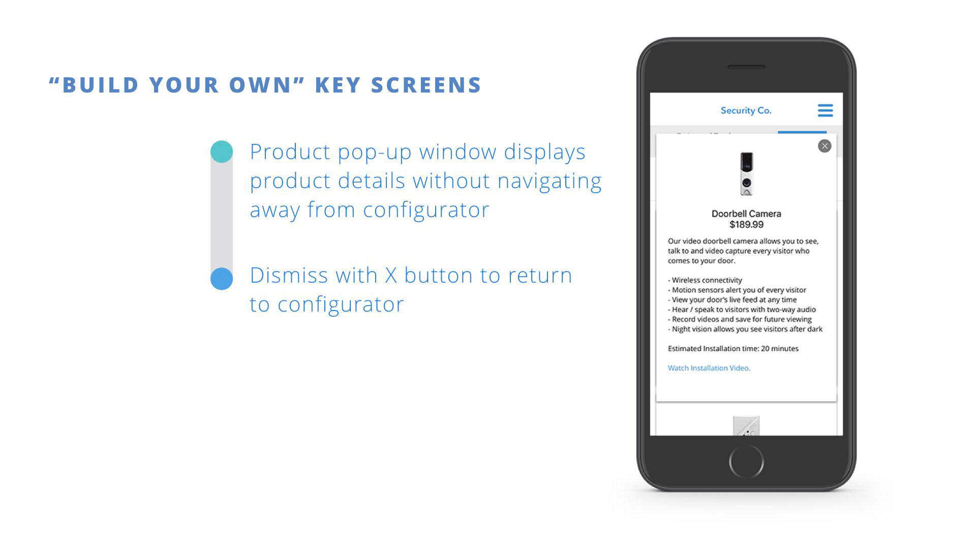
Through our testing, we learned the user wanted more information about each product to thoughtfully make accurate choices for their security needs. This information pops up on its own card without leaving the selection process.
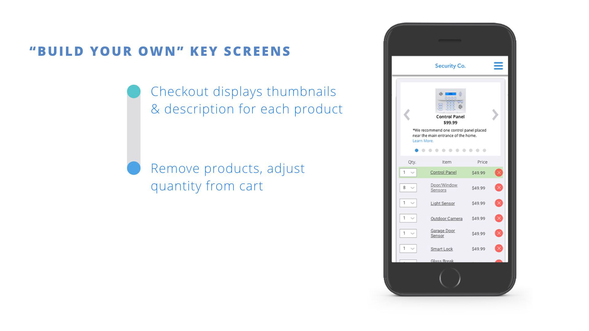
To make the checkout process as simple and painless as possible, we made sure the user had as many options to change their orders as possible, and to review their order before purchasing.
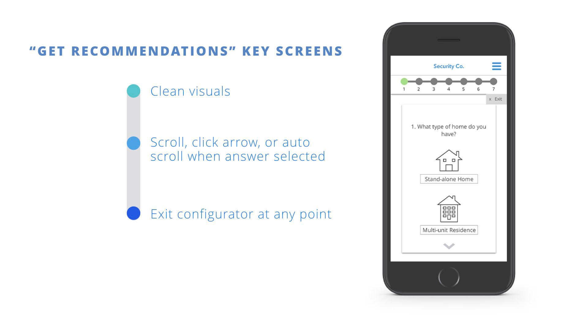
Conversely, these are the screens for the “recommendation” configurator. After answering several questions about the type and size home they have, the company recommends the system that fits their needs. After reaching the final page, the user is still able to adjust their order, giving them the feeling of empowerment.
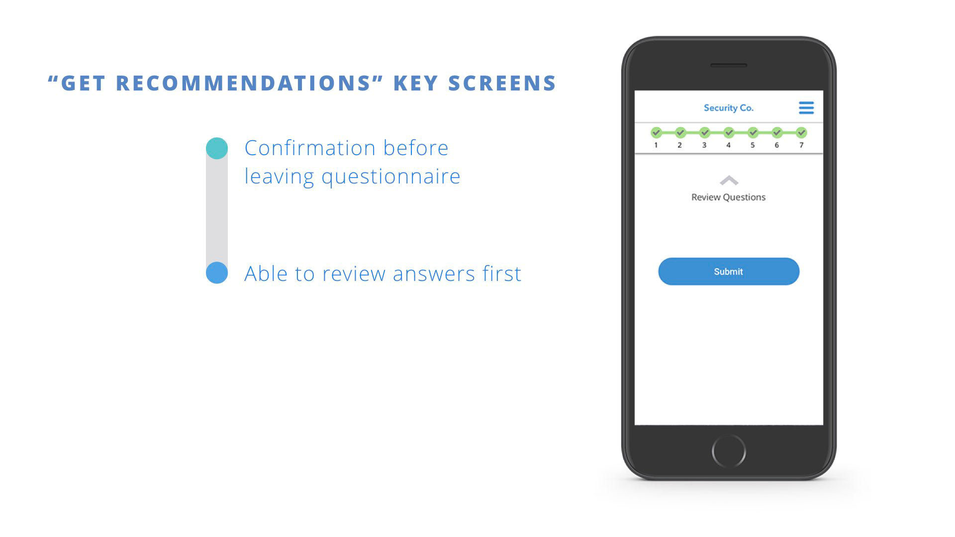
With the progress bar, the user is able to simply see the sequence of questions and answer them thoughtfully before submitting.
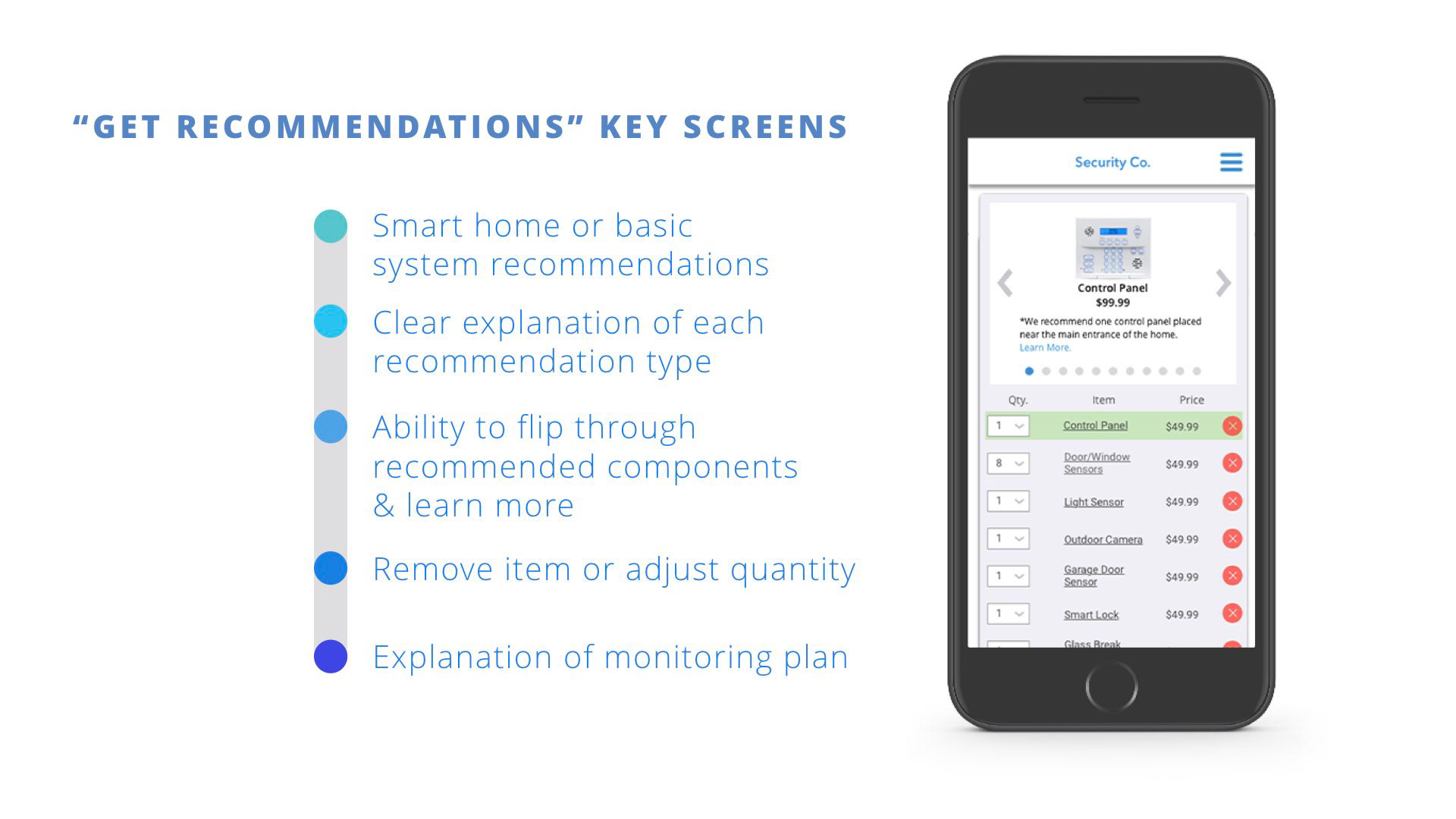
Similar to the "build your own" system, this cart page gives the user the ability to add or delete product recommendations to fully customize their experience.
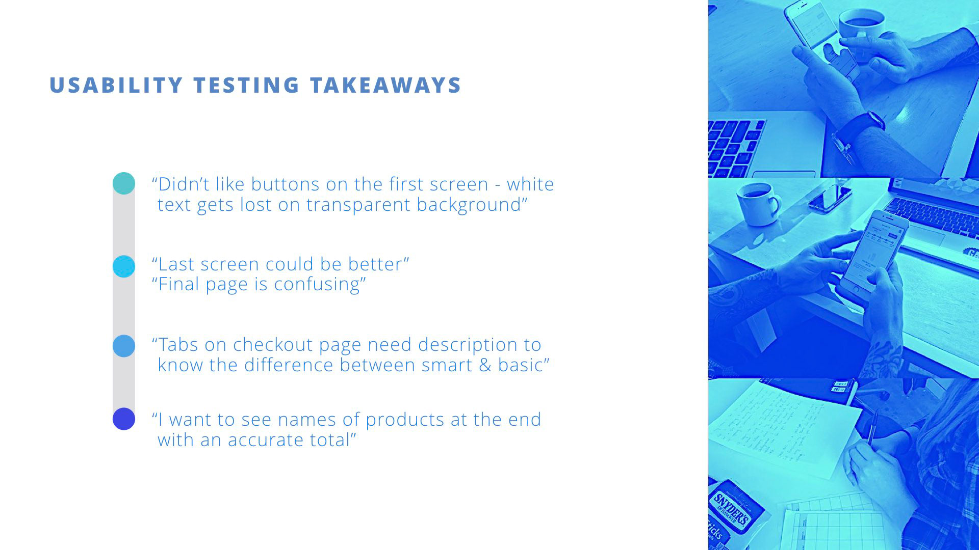
While conducting usability testing, we learned several things to improve the experience for the user. Some of our buttons were modified for better visibility. The final cart page was fixed to be more clearly worded and readable. Tabs were fixed to clearly state the differences between the recommended packages.
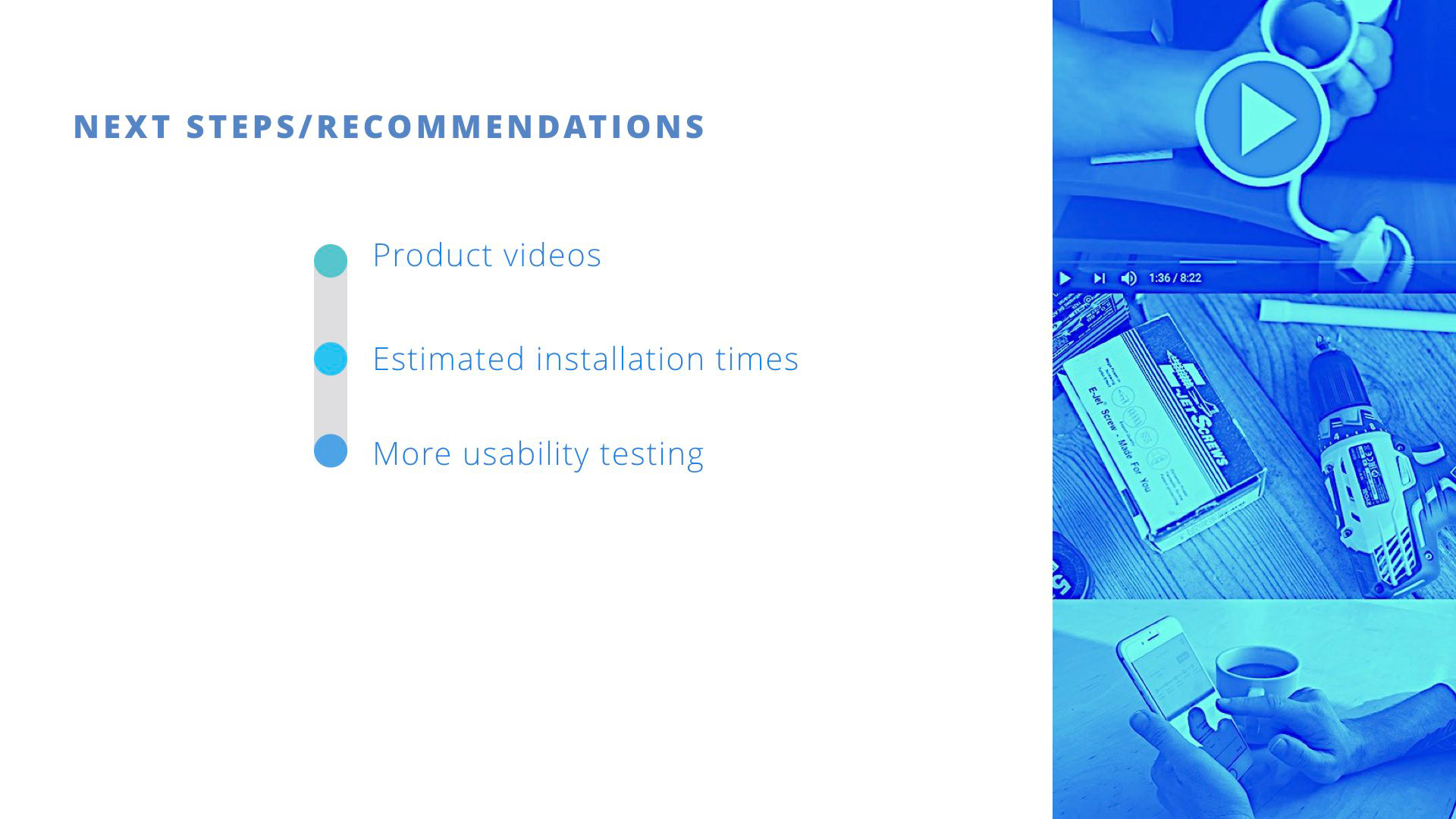
Based on our findings, the next steps we recommend taking are 1) Including instructional videos for installation and use; 2) List estimated installation times; and 3) Conduct more usability testing. We found users were lacking guidance and wanted to understand the installation process before purchasing.